Big Data, No Context, Big Problems
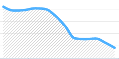
Just look at this graph...not a good trend, right?
How do we know?
Graph(Big Data) - Context == Big Problem
Graphs are visualizations of data optimized for a particular audience: people.
We don't have to be idiots to need simplification. All we need is to be is modern digital citizens, overwhelmed with data, overburdened by it in many cases.
Graphs follows certain principals of design, common expectations, crowd psychology. To illustrate growth in a left-to-right culture, you illustrate low values on the left and show them increasing on the right. Common x-plot values are time, stdev (standard deviation), and relevant ranges of independent variables.
As an aside, I *LOVE Bell curves. Show me your Bell curves and I'll pay for dinner. Every. Time.
Big Data == Insight - Context
Going back to the overwhelming amount of data in our lives, with all this "big data", we still need context...framing around the target problem, which is where "big data" fails for me. It speaks to what it is, but not why. That's where design comes in.
"Design" infers an audience, a "thing" being designed for that audience, and a conscious mapping of the needs of that audience to the features of the thing. Purposeful design is one step beyond that, extending context to a domain, effective use of the "thing".
If you're in the business of big data, you're not an idiot. You are probably purposely designing context into that market every day, whatever it is you're doing. Just, every so often, ask yourself: "Am I providing value to someone?"
Big Data + Context == Insight
Here's a different example of the same values for both axes at the same scale:
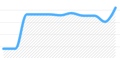
What's interesting in this graph is how there was a dramatic spike at one point followed by a sustained average. The slight dip and hike towards the end is ambiguous in meaning unless you had that sustained average.
Until now, I've purposely left out context for these graphs to make a point. Here it is for this one: someone got smart about PR in 2014, didn't fake anything, and is working hard to make sure people are happy.
Graphs are worthless without context. Don't expect dashboards to save you unless you understand what the graphs really mean in context.